Wednesday, 28 September 2011

Lizzard Channel - song chosen, props and idea's

I have been down to my chosen band's studio to talk with the majority of the 8 piece band to understand what they want inside their music video. I want to produce a music video which they will be happy and comfortable acting and playing their music while I will be filming. The song I have chosen to produce a music video to is 'No.1 In Sheboygen'. When asking Lizzard Channel what they would like this music video to look like they said the theme of the video should be based around St.Ouens beach and a collage of their performances reflecting the lyrics of the song.

I would like to produce a music video with a similar sort of style as foster the people's as it looks like a collage of their live's but obviously my music genre is far more upbeat therefore the way that i will edit my video needs to work with the speed of the song. I think to produce a video with similar qualities of the pumped up kicks music video i will need a variety of locations and shot's. One of my ideas will be filming them socialising as well as playing music in front of a live audience.


LYRICS

"This is who i am
This Is what i look like
People Cast Opinions
Cos It Doesn't Quite Look Right
Seeing 12 Kids all crammed in a van
Trying to get waisted Anyway They can
Now we got transport
We never have to skate
Hitch or walk but we'l still be late
Full Restricted 35 Tops
Getting Pulled over DUI by the cops

It's been a while
SInce I
Been laid in the van

Pre Chorus:
Why can't this be
The right path for Me

Chorus:
Im a lizzard till i die
in this carpark il rot alive

Here I am
6 years on
still a young man
living like a bum
Im staying this side of the 9 by 5
cause the carneys and pikeys live the other side
anytime we head out to the east
We smash out in town and chase some quiche (Quiche)
but we only end up chasing ourselves
cause we're barred from chambers and our local as well

It's been a while
since I've
Been let in the Splash

pre chorus

chorus


As I will be using a local band, I will not need to find actors and do auditions as the band fit they already fit the stereotypical ska/punk band and all can play instruments and sing! They are a band of up to 8 people when all members are in jersey. but usually it is 6 male members, all with different slightly different lifestyles which I think i want to portray in my video by filming plenty of fills. As in recording their hobbies' and social events as i think this will make my video slightly different from others.


The majority of the props which will be used will be the music equipment such as - amps, microphones, drums, mic stands, leads, guitars, trumpets. However I would like to incorporate props such as headphones, skateboards, surfboards etc to capture items of their lives inside my video. All members of the band surf so I will more then likely use a beach as a location and also include some footage of them surfing.

Tuesday, 27 September 2011

Lizzard Channel Interview


This interview has helped me gain a better understanding of what the band want to be seen within their music video. I have opportunity's to use their equipment and permission to film them playing their music!

Monday, 26 September 2011

Digipaks

I have chosen the majority of these digipaks based on the genre of music they produce and because most of them are bands.


This blink 182 digipak illustrates there immature, funny and rude nature. The main picture is of a good looking dressed up nurse. The colour red is used here to attract the audiences attention towards her lips and bra while the majority of the picture colour is a black background with her white shirt. While she is wearing a b,ink 182 badge which at that time was very distinctive.


This theme is carried onto the back of the cover, while this shot includes the band acting for the camera. The female actor used in this picture looks like the stereotypical woman who would admire and fancy this band.


The disc has the logo of blink 182 at the time, in a light blue and white colour, which is associated with boys. The leaflet as you can see below is included which has the bands lyrics of their songs while on the back is various photographs of the band and possible friends posing in a line.


Very creative and amusing.


Underneath the disc appears to be someone's eye, someone staring straight back at the consumer. The yellow theme is carried on here as well.


I like this green day digipak as it reminds me of some very old school photographs, i like the lay out of  this cover and back, photo's in sections. The black and white theme is complimented by the bright yellow dots covering the peoples faces adding a feel of uncertainty and disguise.


The black, white and yellow theme is carried on throughout the case. The disc and leaflet both have writing scribbled down, producing a unfinished/ruff editing feel.


Underneath the cd they have chosen to place a photo of the band members hugging and looking up at the camera in very bold clothing. Their facial expression provides us with a don't care attitude.


This razor light front cover looks like a sort of scrap book, with random objects thrown together. The colour red in present throughout this digipak, without it, it would be very plain and probably would not attract the audiences attention.


I like the dotted effect on the back and which is also present on the cd and leaflet.


The inside has no eye catching colour only a 'individual' design consisting of dots.


Underneath the cd is a picture of a man asleep/passed out in a van. The picture is not very clear.


This rise against digipak reminds me of war posters, stamps and tea bags. I like the old school style and silhouettes designs. There is only 2 main colours of the cover, light yellow and black.


The cd carries on the same kind of design, with big R and A letters which reseamble the band name Rise Against. I love this piece of art work, it would of taken a long time to make.


On the back there is a silhouette of the band and their lyrics in a font which looks like the old typewriters could produce.


This is another blink 182 digipak. The colour scheme is mostly black but with green, red and yellow which could be associated with the Jamaican flag. I like the way the cd's have very simple designs yet they resemble parts of their lives.

Thursday, 22 September 2011

Music Sale Posters


This poster is plain, simple and very effective! I like the way the main artist is harshly cropped into the picture, and by his hand pointing right into the camera it really attracts the audience's attention. His clothing is mostly black and the picture is slowly fading out into black at the bottom of the image, The lighting is pointing directly onto the side of his face, bringing out the artists facial features/expression, and because half of his face is in the dark acts as if he is coming out of the darkness and symbolising the 'not affraid' wording which is in big capital lettering based at the bottom third of the poster. I also like the way the artists name is in smaller writing and in a different colour. As he is a solo artist i think it is only right for him to take up the whole shot.


This music poster is very well set out, not too much is going on which is why I like it. The big bold lettering at teh top which is combined with the extended letters such as the R and N within the title provides this poster with a sense of individuality, creating a unique font. The strong pose of the full band at the bottom of the picture looks great. With the lead singer standing above the rest of the band, illustrating a hierarchy within the band. The male artists are all wearing very formal clothing, black suits and shirts etc. This matches the stereotypical look for the genre of music they produce. With some of the band members wearing sunglasses to disguise their faces.


This poster is mostly black with the main colours coming from the photoshopped picture in the based in the middle of the poster and the band/album name. In contrast to Eminem's album the Fo Fighters have decided to make their band name far bigger then the album name on this poster. This would of been done to attract the audiences attention to their very recognisable name. By underlining the 'number one' lettering this enables the audience to read this as a key feature on this poster. I like the main picture of the band members in pink, red, green and blue as it stands out on the black background. The album name is called 'wasting light' which is why i think they have decided to use a black background with a range of various bright colours to emphasise the wording.


The theme for this poster has been chosen by the album name 'neighbourhoods' as the illustration is of a comic town, with big buildings with the band name embedded within the buildings in a slightly darker shading. With the bottom third of the poster in a text box with their album information etc all written in comic san's capital letters which is normally used and seen in most old classic comic books. I like this as they are an old band releasing a new album into today's modern world. using a comic book theme. The colours again are plain and simple all in black in white.

Wednesday, 21 September 2011

Idea's so far

Starting to think ahead now, after watching loads of music video's in the last couple of weeks and choosing my band/actors I want to narrow down a few choices of what and where to film to produce my music video.

Location idea's:
- Live Performance - infront of a real life audience - this depends on the dates of gig's
- Studio - Cables, amps, microphones, equipment
- Car - fish eye camera would be useful ( a bit like the other Lizzard Channel music video which i have posted).
- Road/Bunker - dress up ?

Lizzard Channel Lyrics - Back to The drawing board

Be the kind of guy who gets a Joint twice
Not out of coincidence not out of choice
Chicks look up they greet you with a smile
The 9 - 5 aint fun your in denial
Pre chorus
There’s a better way, there’s a better way
To live your life and spend each day
A wave hits me when I’m in the sea
Satisfaction of living care free
(Now live care free)
Chorus
I Lie awake
(The gears still turn)
I watch the clock (tick tock)
Closer every minute
To the sound of the daily grind
Shine your shoes over Cobble Street
Fuck the stairs I’ll take the lift
Take the roll but not the hit
Just like yesterday
Buttoned Up shirt with the looks
Short back and sides
Just had it at the barbers
On a lunch time, just like the last one
Say fuck this next time your in the boardroom
Pre chorus
Chorus
This aint for me
(I wouldn’t wish it on you) 
This is success
On how we were taught to be at school

Tuesday, 20 September 2011

Lizzard Channel Lyrics - Mumma's Boy

Deluded kids get drunk in daddys car
(drinks on me)
We'l rip em off and sell em fucking herbs
(its a twig)
For We Know Wealth and their wealthier than us
(Thats Why)
When i was young i rode the bus
Chorus:
Rap your boy in cotton wool
give him a lift in a 4 by 4
public transport smells of piss
we'l rip you for the skanking kids
A 20 from mothers purse
(Be a good boy)
Blow it on gear and clear your thoughts
(fuckin braindead)
When the hits gone its time for bed
(say to mum) 
I've got it all when you and dad are dead
Chorus

Sunday, 18 September 2011

Decision - chosen actors

I do think that it would be stupid if I did not use Lizzard Channel, as I am very good friends with them, they produce the sort of music which i will find fun, exciting and challenging to produce a music video to. They are also very confident playing their equipment and in front of the camera, they have all the equipment for their parts and also a recording studio which could become very helpful for locations settings etc.

I feel as if they (Lizzard Channel) fit the stereotypical ska/punk band so i will be using them as my actors as well, potentially also a few other people depending on what it is that I am going to film.

The next big decision is to choose one of their songs!

I will upload some photo's of the band soon!

Tuesday, 6 September 2011

Arcade fire - Ready to Start

I like this music video as it is solely based around a live performance, putting the viewer inside the concert but with the range of different shots and angles. I also noticed the quick depth of field changes during the majority of the clips. Location looks as if it is based inside an opera house with lots of fan's jumping aroud, the lighting of this video is great with the quick flashes combined with the up beat music goes very well together. The whole video was shot in black and white which individalises this video and defines the crowd far easier with some parts of the mise en scene in complete darkness in contrast to the bright white sections of poeples faces.


I like this first shot as it puts the viewer in the crowd, focusing on the clapping hands. The lighting allows the solid black back ground to take up half of the shot. I feel the black background also creates a strong contrast with the spotlight shining on the body parts.

This shot is great as it allows us to see the whole band playing together in front of their fan's. With the lighting behind the band this automatically makes your eyes draw towards the light especially as it is not directly in the middle, the director has used the rule of thirds inside this shot attracting the viewers attention.


I really like the silhouettes in this shot, really putting us in the crowd, especially as it is in black and white makes this shot even better. Depth of field has been used here to make us focus on the band.


This low angle medium shot comes out great with the spot lighting. Because it is shot from a low angle it acts as if we are seeing the main singer from the front of the crowd looking up at him.


Overall the main points which I like from this video, the silhouettes in the crowd looking at the band (looking from different points of the crowd, front, middle, sides, top). The location, basic opera house, and the camera technique which creates the atmosphere as if the viewer were there. e.g unsteady shots, making them feel involved in the crowd.

Monday, 5 September 2011

Lizzard Channel (Possible Artist)

This is a ska punk rock band local band from jersey, they are an unsigned band and produce good fast vibrant music. The genre of their music is ska/punk/rock, which includes high tempo up beat sound. I would like to focus on this genre into more detail as it would allow me to incorporate quick editing skills and variety of shots, I also enjoy this type of music. Lizzard Channel's songs create many possibilities for music video's as their songs are about their lives etc. Only one of their songs have been produced into a music video before, check it out on the link below.


I enjoy this music video a lot as it has both a narrative and includes the band playing in their studio. I think the wide angle shots when they are in the car works well when the beats of the music increase. The lighting of the video is not great and could easily be improved upon.

They have a few songs on their myspace which I could potentially be interested in using to produce a music video from.

http://www.myspace.com/lizzardchanneluk

Sunday, 4 September 2011

Foster The people - Pumped up Kick's

The footage used in this video is a mixture of live performance's, recording studio's, other hobbies' etc. This video work's so well because it acts as an insight into the artists life's, with some very effective focus pull shot's carried out throughout the music video.


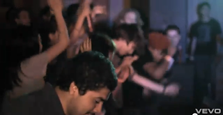
Shot's which include people dancing to their music make the viewer feel part of the crowd. The depth of field in this shot come's out great because it looks like there is far more people dancing in this shot than there actually is.


The spotlight in this shot produces a great effect, really bringing out the singer's figure.


I like this part of the video when it is in black and white while only the surfboard's are in colour. This takes all of the viewer's attention towards the surfboard and activity. Something which i could consider if i use a narrative in my video.


Quick edit shot's of the artists chilling out go very well with this song. This fine depth of field silhouette shot produces a very distinctive outline of one of the band members.


This extreme close up shot has a nice shallow depth of field, with the light reflecting of the symbol. A strong contrast of colour which all adds to a professional looking shot.


This low angle shot produces an 'in the crowd' feel for the viewer. The spotlight above the signer keeps the audiences attention, coming in and out of focus.


lot's of focus pull shot's are incorporated in this video which give off a great effect.


http://www.youtube.com/watch?v=SDTZ7iX4vTQ

Saturday, 3 September 2011

Rise Against - Savior


I like the flare in the opening shot of this music video because it creates a a bright red glow which represents, evil, blood, fire etc. This introduction would not be seen in a love song for example.

I love the narrative in this video because it is so random, using fancy dress works very well and something I might want to consider when I come to plan and film my music video. This shot has two main colour's black and blue in contrast with the shot above red and black. I love the shadows created from the roof lights as well.

This extreme close up shot works well as the viewer already knows what this animal is. I like the way the nose and the right eye is in full focus and the head takes up the whole shot, really drawing the viewer towards the bears features.

When the music kicks in and get's going the video cut's to the band location proving instruments to the music. What you can hear is what you can see on the screen, this is what usually happens on most music video's when the first lyrics kick in.


This out of focus slow motion shot is complimented with the black background in contrast to the spotlight on the musician's face.

this tilted shot gives off a sense of distortion and confusion. I like the reflection on the guitar as it attracts the viewer towards the instrument.

flipping the video sideways creates a dramatic effect making the viewer turn their heads.


I like this shot because usually when the singer is playing in front of a huge spotlight, they turn into a black silhouette, but there is obviously a side light shining on his face which enables us to make out his facial features. these two different end products are something  could think about and practise when I come to my filming.