Friday, 20 January 2012

Making the conventional and unconventional posters

I first of all wanted to create a funky poster which would definitely not be allowed in a HMV window. During my research stage I realised that most posters advertising albums do not have much colour, therefore i wanted to create an unconventional poster including a lot of colour.


I used a harshly cropped photo to produce this poster, I wanted to use a picture of a band member so that the audience can automatically recognise what the poster is about. I cut around the main singer using the magnetic tool on photoshop, this allowed me to add in a background layer of my choice.


I used a website called 'brusheezy.com' to downloand a brush effect, I carried this effect onto my main picture as well as the background of the poster.


I found it very hard to choose a font for the 'Lizzard Channel' writing. I wanted a clear, easy to read font so I placed four different fonts next to each other to make it easier to choose from.


I started to add in the HMV writing which is compulsory on music posters. I found the writing quite hard to read on the multi coloured background, therefore I used the stroke tool on photoshop to add an outline to the writing.


This is my finished unconventional music poster, I like the layout of the design and I think the colours give off a great effect, I could not see this being placed in a HMV window because of the huge differences this poster has compared to real media products.


This is my conventional poster, I have chosen a fairly dark photo, with some nice lighting on the drummer which makes the poster instantly relatable to the band. I have maximised the use of black spacing on the left hand side of the picture for the majority of the compulsory writing. I have also placed the bands name at the top of the poster which would be the first thing the viewer would pick up on.


Added in the HMV logo of the dog and made a drop shadow to help make it stand out.

Sunday, 15 January 2012

Making the digipack

I have started to create my digipak on InDesign and Photoshop. I would like the picture on the inside cover to spread over both panels like you can see below. This is a similar technique used on the blink 182 album that I looked at during the research stage of my A2 coursework. As you can see the photo is of the car park which I have used within my music video which makes this a very recognisable picture.

The CD carries the same picture used on the inside cover because I feel this effect looks professional and could also help the consumer to realise the CD is missing if it were not inside its case.


I used photoshop to create the front cover, I wanted to create a similar effect as seen on the 'Example' front cover which I looked at during my research stage on this coursework. I want a collage of pictures which relate to the music video and symbolise what Lizzard Channel stand for, therefore I used a mixture of shots from different locations.


This is my finished conventional front cover, I used a brush effect which I downloaded from 'www.brushezzy.com'. I wanted to create screwed up paper effect.


I carried the brush effect onto the inside cover to make the digipak similar and relatable throughout.


This picture shows my final digipak, including the parental advisory and sony logo's aswell as a barcode to give the digipak an authentic look.

I also wanted to create an unconventional front cover for my digipak. I feel the 'Lizzard Channel' font works well with the black TV but I do not think this would be a great front cover for an album because it will not be very recognisable as there are no band members on the front cover. But if the band were looking to set their own trend and look individual they may prefer this one.


Tuesday, 10 January 2012

first draft

http://www.youtube.com/watch?v=83b9DfgBJQ8&feature=youtu.be


I have uploaded my first draft of my music video to youtube. There are a few parts which are unfinished but I feel I have the majority of the video is in place. I will also show this to Lizzard Channel to gather some feedback.

Tuesday, 13 December 2011

GoPro time lapse

http://www.youtube.com/watch?v=yKF8ayVfTE0&feature=g-all-u&context=G2f06ebbFAAAAAAAAAAA


this is something i did in the summer, maybe i could incorporate a time lapse within my music video as i have noticed that a lot of music video's do use time lapse photography within their products.

Monday, 28 November 2011

picturing my music video

I sat down and listened to my chosen song a few times and tried to write what I could  picture during the lyrics/beat of the song. I have taken into account what my target audience and also what Lizzard Channel want to see in their music video.

00:00 - 00:30 - fast edits, different locations of band playing music, guitar drums
00:30 - ed (vocalist) intro followed by each stuff, van, skating, surfing etc
00:40 - back to all band
00:45 - ed singing
00:50 - studio fast edits
00:56 - possibly little boy singing
1:00 - bands studio with song beach scenes
1:20 - main vocalist (dolly) different angles of lip syncing
1:40 - setting up footage, bright lighting - more band equipment - guitars etc.
1:54 - possibly little boy/ main vocalist
2:00 - beach stuff, surfing, having fun, fast edits.
2:10 - panning shot's of guys singing chorus/choir with few quick edits of various things.
2:30 - guitar solo - fast cuts
3:00 different locations band mixed in with funny footage

Wednesday, 23 November 2011

Target Audience

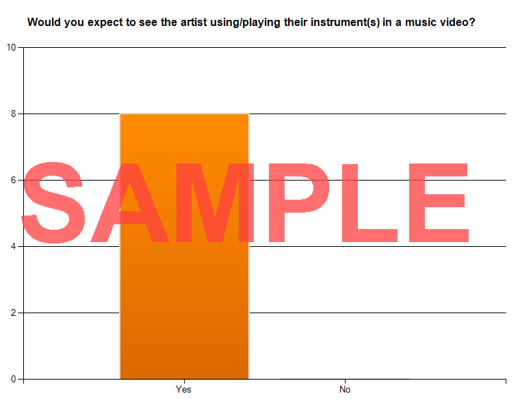
This web link takes you to my online survey which I have created to help gather information, I used survey monkey, a free online website which allowed me to easily collet responses. The answers will give me some interesting information about what people expect to see in music video's of my genre, giving me an indication of what I need to include within my music video.

http://www.surveymonkey.com/s/YNW3W2F


These are the results which i have already collected. I have presented the results in a column graph.


Key demographic:
This is Ryan, he is 18 and his favourite music is ska/punk - he attends live gig's and enjoys being in mosh pits! His favourite artists are - Blink 182, Greenday and Lizzard Channel.
He has a part time job in a surf shop during the weekends and his hobbies include surfing, skateboarding and making short films.


In this video I asked my key demographic questions to help me understand what my typical audience expects to see within a music video of the same genre.


Tuesday, 22 November 2011

Photoshop Poster Practise

This tutorial was very helpful and challenging, I learnt how to use liquify and other tools to produce a skull smoke effect. I am not 100% happy with the final outcome because I do not think that the skull blends in with the smoke very well but its helped me become more aware and familiar of the photoshop tools.


Thursday, 17 November 2011

Compressing footage

I have now filmed various parts of my music video such as the Lizzard Channel live gig at the Jersey Bowl. This week I have been using Compressor to correct my footage so far. I have been using Apple ProRes 422 setting as this is the best setting to compress Canon 7D footage

here are some screen grabs which illustrate the setting which I have been using. By doing this to my footage it will allow me to edit my music video in Final Cut Pro much faster!


Monday, 7 November 2011

School Interviews

My teacher asked myself and another student to film 7 mock interviews of lower sixth students practising their interview techniques. To do this we used 3 camera's, which would allow us to capture their full facial expressions during the interviews. The camera in the middle was static which would be filming throughout each interview while we used two Canon 7D's from filming from opposite angles.


Using the Canon 7D for this task has helped me feel more confident when using equipment.

Saturday, 5 November 2011

Equipment testing

This video shows me using the Canon 7D which I will be using to shoot my A2 music video with. I learnt the fundamentals today like changing the ISO and aperture settings and also using the dolly. I enjoy using the dolly as it allows me to get a smooth travelling shot. I will try and incorporate this in my music video as I think this technique looks professional.

CLICK ON THE LINK BELOW TO SEE MY EQUIPMENT TEST VIDEO!

http://www.youtube.com/watch?v=z5Iv9XQkqoE&feature=youtu.be

I will be using the following pieces of equipment to produce my music video and ancillary tasks:
Canon 7D - various lens and attachments
Tripod
Dolly
Mac - Final Cut Pro, After Effects, iMovie, Photoshop, InDesign and many other softwares.

Wednesday, 2 November 2011

Photoshop Practise


In class we used tutorials to practise our photoshop skills. In this tutorial we learnt the basics and fundamentals to create a poster.


Monday, 31 October 2011

Animatic


This animatic represents shots which i want to incorporate within my music video. The layout and length of these shots are my first idea's therefore when i go about filming my music video I will take more shots which i think may look good on the day of filming.

Tuesday, 25 October 2011

Storyboard


I created a story board to get my idea's onto paper. As you can see from the pictures I want to include a lot of band shots where they will be playing, but I also want to have a few fill shots which will relate to the lyrics of the song.


Monday, 17 October 2011

practise - POSTER 3

I wanted to play aorund with the title on this poster and try and create something interesting.


This picture shows how I have used the background picture to fill in the text of my title. I think maybe with a clearer picture this effect would look much more professional.


Here I have used the magnectic cutting out tool to carfeully carve aorund the main singer. I have then made this image a rasterised image by making the file a 'PNG' file.


I then placed this rasterised image on top of the text making the lead singer look infront of the text compared with the two other people in the picture.


I then proceeded to add in the compulsary HMV text onto the poster. I realised that the black writing was not very clear on the dark background image, therefore i changed the text colour to white.


This is my best poster yet, I like how the middle person is in front of the text and is much brighter, as if He is looking up at the sky and he is in the spotlight. I have incorporated the album front cover as well which makes this poster seem like a real media product.