
A2 Media Studies
Monday, 31 October 2011
Animatic
This animatic represents shots which i want to incorporate within my music video. The layout and length of these shots are my first idea's therefore when i go about filming my music video I will take more shots which i think may look good on the day of filming.

Tuesday, 25 October 2011
Storyboard
I created a story board to get my idea's onto paper. As you can see from the pictures I want to include a lot of band shots where they will be playing, but I also want to have a few fill shots which will relate to the lyrics of the song.


Monday, 17 October 2011
practise - POSTER 3

I wanted to play aorund with the title on this poster and try and create something interesting.

This picture shows how I have used the background picture to fill in the text of my title. I think maybe with a clearer picture this effect would look much more professional.

Here I have used the magnectic cutting out tool to carfeully carve aorund the main singer. I have then made this image a rasterised image by making the file a 'PNG' file.


I then proceeded to add in the compulsary HMV text onto the poster. I realised that the black writing was not very clear on the dark background image, therefore i changed the text colour to white.


This is my best poster yet, I like how the middle person is in front of the text and is much brighter, as if He is looking up at the sky and he is in the spotlight. I have incorporated the album front cover as well which makes this poster seem like a real media product.
Saturday, 15 October 2011
digipak practise - 3

I used photos from Facebook on this digipak. I like this photo as it has all the band members in the shot.

I edited this photo in Adobe Photoshop. I used the burn tool to reduce the colour around the edges and left the colour on the main vocal singer. I feel that this emphasis the photo and brings out the 'live gig'.

The image is a perfect size to be stretched from the front cover to the back cover. I like the idea of the band name to be coming out of the trumpet.

This is the CD I produced in InDesign


Thursday, 13 October 2011
practise - POSTER 2

I used photoshop to cut out each band member from a photoshop which was viewable on the web. I wanted to create a poster which really grabs the audiences attention and i think that this can be done by getting your actors to stare straight at the camera to make it feel as if they are looking straight at you. I feel that the poster should follow a pattern that is why i sued pictures from the same photo shoot and only using people with roughly the same coloured clothing.

Scaling the bodies down to fit inside the rectangular poster and harshly cropping off sections of their bodies, this puts the majority of the attention onto their facial expressions. I like the font as i feel it fits the stereotypical poster conventions for this genre of music along with bright colours to really attract the audience.

A light blue is just enough to produce a more professional effect. I think that the colour is just right, if it were any darker blue it would be more associated with a boy bad such as Westlife, as this band looks and try to create a more manly stature then Westlife they suit a lighter/grey blue.

This screen shot shows the extra added writing which I feel that it follows the typical conventions of a music poster which would be placed inside HMV. You can see the placement of the HMV logo, bottom left and the pre made album cover - Come Around Sundown. I think that the fonts in pink follow the recognisable HMV writing which is used on their posters.
Saturday, 8 October 2011
Digipak practise - 2

I found this image on the internet and i like the quirky idea of using a fake lizard within my digipak. I think using funny images would reflect well on the band as they are known as entertaining their friends and fans. I used Photoshop here to cut around the lizzard using the 'magnetic lasso tool' which would enable me to separate the lizzard from the surroundings which were not useful towards my project.

This screenshot is an example of importing the images which i thought would be useful within my work.

After setting the right size of my image. I focused on fonts for my title, I think by placing the 'L' behind the image the band's name is still clear as an instant reaction to seeing a picture of a lizzard it automatically makes you think of the word followed by the bands name.

I tried to stick with a basic colour theme of only using 3 main colours, green, purple and black. I realise that the digipak looks far more realistic and professional when there is not too much going on within a digipak.

I later added some copyright writing around the CD which is also seen on CD's today, this writing adds to the professional effect. Using gradient tools both on the back and front helps create a recognisable and eye catching theme for this digipak.
Monday, 3 October 2011
digipak practise - 1

Another part of my A2 media coursework is to produce a digipak for my chosen artist. i have to create a digipak based on the music video which i will be creating. I will be using InDesign to produce a front cover, back, inside and CD.

This is my first practise creating a digipak, I have chosen a well known band - blink 182. I wanted to create a digipak with some similar features of their albums, such as the 3 colour theme - red, green and yellow.

I like the way the numbers have a different coloured gradient placed over the top of them. By spreading out the numbers i thought the colour sections look good. I feel as If it might even be better if i only had 182 on my front cover, as they are such a well known band, people would still recognise their album.

I love the coloured stencils of random objects, a similar method they used within their actual album. Placing a parental advisory logo made this digipak seem more realistic along with the bar code.

I am happy with the final outcome of my first digipak knowing what to do, how to do it and what can be achieved. I think that the inside cover may need something more, either some words or more pictures to create a more professional look. I think that albums need to have a theme, weather that be fonts or images, and I think that this digipak does not carry a powerful theme throughout, this is something I can work on within my next digipak.
Saturday, 1 October 2011
practise - POSTER 1
As part of my A2 coursework I've researched and porduced a music poster which advertsises the album which we will also have to make. This would be done using Adobe Photoshop and InDesign!

I like this Green Day poster as it looks very simple yet it would look like an illusion when on stuck on a wall for example as it would look like someone has sprayed it on. I think they have chosen produced this poster as it is because Green Day are seen as rebellious and graffiti on walls also has these connotations. The criminals which spray graffiti on walls would also be the stereotypical audience and market which green day's music is admired by.

I want to create a simliar sort of poster using images I have found of the internet, I used a piece of artwork produced by Banksy. I used Photoshop to cut around the person which would allow the background, the wall, to be placed behind. I felt as if this worked well with the photograph but I thought that the background image was too busy.

I found a more simplistic image and swapped it. Yet it still lacked the effect of the original Green Day Poster.

By adding gradient tools within InDesign I was able to create a brighter background which helps attract the audiences attention.

I later added similar fonts to those of the original poster to try and capture the same effect.

I think that this poster has come out well but I think that more information could be added which would help make the poster look more realistic such as tour dates who is selling the album etc.
But for a first try using InDesign I am happy with the progress and understanding of the software.
I like this Green Day poster as it looks very simple yet it would look like an illusion when on stuck on a wall for example as it would look like someone has sprayed it on. I think they have chosen produced this poster as it is because Green Day are seen as rebellious and graffiti on walls also has these connotations. The criminals which spray graffiti on walls would also be the stereotypical audience and market which green day's music is admired by.

I want to create a simliar sort of poster using images I have found of the internet, I used a piece of artwork produced by Banksy. I used Photoshop to cut around the person which would allow the background, the wall, to be placed behind. I felt as if this worked well with the photograph but I thought that the background image was too busy.

I found a more simplistic image and swapped it. Yet it still lacked the effect of the original Green Day Poster.

By adding gradient tools within InDesign I was able to create a brighter background which helps attract the audiences attention.

I later added similar fonts to those of the original poster to try and capture the same effect.

I think that this poster has come out well but I think that more information could be added which would help make the poster look more realistic such as tour dates who is selling the album etc.
But for a first try using InDesign I am happy with the progress and understanding of the software.
Wednesday, 28 September 2011
Lizzard Channel - song chosen, props and idea's
I have been down to my chosen band's studio to talk with the majority of the 8 piece band to understand what they want inside their music video. I want to produce a music video which they will be happy and comfortable acting and playing their music while I will be filming. The song I have chosen to produce a music video to is 'No.1 In Sheboygen'. When asking Lizzard Channel what they would like this music video to look like they said the theme of the video should be based around St.Ouens beach and a collage of their performances reflecting the lyrics of the song.
I would like to produce a music video with a similar sort of style as foster the people's as it looks like a collage of their live's but obviously my music genre is far more upbeat therefore the way that i will edit my video needs to work with the speed of the song. I think to produce a video with similar qualities of the pumped up kicks music video i will need a variety of locations and shot's. One of my ideas will be filming them socialising as well as playing music in front of a live audience.

I would like to produce a music video with a similar sort of style as foster the people's as it looks like a collage of their live's but obviously my music genre is far more upbeat therefore the way that i will edit my video needs to work with the speed of the song. I think to produce a video with similar qualities of the pumped up kicks music video i will need a variety of locations and shot's. One of my ideas will be filming them socialising as well as playing music in front of a live audience.
LYRICS
"This is who i am
This Is what i look like
People Cast Opinions
Cos It Doesn't Quite Look Right
Seeing 12 Kids all crammed in a van
Trying to get waisted Anyway They can
Now we got transport
We never have to skate
Hitch or walk but we'l still be late
Full Restricted 35 Tops
Getting Pulled over DUI by the cops
It's been a while
SInce I
Been laid in the van
Pre Chorus:
Why can't this be
The right path for Me
Chorus:
Im a lizzard till i die
in this carpark il rot alive
Here I am
6 years on
still a young man
This Is what i look like
People Cast Opinions
Cos It Doesn't Quite Look Right
Seeing 12 Kids all crammed in a van
Trying to get waisted Anyway They can
Now we got transport
We never have to skate
Hitch or walk but we'l still be late
Full Restricted 35 Tops
Getting Pulled over DUI by the cops
It's been a while
SInce I
Been laid in the van
Pre Chorus:
Why can't this be
The right path for Me
Chorus:
Im a lizzard till i die
in this carpark il rot alive
Here I am
6 years on
still a young man
living like a bum
Im staying this side of the 9 by 5
cause the carneys and pikeys live the other side
cause the carneys and pikeys live the other side
anytime we head out to the east
We smash out in town and chase some quiche (Quiche)
We smash out in town and chase some quiche (Quiche)
but we only end up chasing ourselves
cause we're barred from chambers and our local as well
cause we're barred from chambers and our local as well
It's been a while
since I've
Been let in the Splash
since I've
Been let in the Splash
pre chorus
chorus
As I will be using a local band, I will not need to find actors and do auditions as the band fit they already fit the stereotypical ska/punk band and all can play instruments and sing! They are a band of up to 8 people when all members are in jersey. but usually it is 6 male members, all with different slightly different lifestyles which I think i want to portray in my video by filming plenty of fills. As in recording their hobbies' and social events as i think this will make my video slightly different from others.

The majority of the props which will be used will be the music equipment such as - amps, microphones, drums, mic stands, leads, guitars, trumpets. However I would like to incorporate props such as headphones, skateboards, surfboards etc to capture items of their lives inside my video. All members of the band surf so I will more then likely use a beach as a location and also include some footage of them surfing.
Tuesday, 27 September 2011
Lizzard Channel Interview
This interview has helped me gain a better understanding of what the band want to be seen within their music video. I have opportunity's to use their equipment and permission to film them playing their music!
Monday, 26 September 2011
Digipaks
I have chosen the majority of these digipaks based on the genre of music they produce and because most of them are bands.

This blink 182 digipak illustrates there immature, funny and rude nature. The main picture is of a good looking dressed up nurse. The colour red is used here to attract the audiences attention towards her lips and bra while the majority of the picture colour is a black background with her white shirt. While she is wearing a b,ink 182 badge which at that time was very distinctive.

This theme is carried onto the back of the cover, while this shot includes the band acting for the camera. The female actor used in this picture looks like the stereotypical woman who would admire and fancy this band.

The disc has the logo of blink 182 at the time, in a light blue and white colour, which is associated with boys. The leaflet as you can see below is included which has the bands lyrics of their songs while on the back is various photographs of the band and possible friends posing in a line.

Very creative and amusing.

Underneath the disc appears to be someone's eye, someone staring straight back at the consumer. The yellow theme is carried on here as well.


I like this green day digipak as it reminds me of some very old school photographs, i like the lay out of this cover and back, photo's in sections. The black and white theme is complimented by the bright yellow dots covering the peoples faces adding a feel of uncertainty and disguise.
The black, white and yellow theme is carried on throughout the case. The disc and leaflet both have writing scribbled down, producing a unfinished/ruff editing feel.

Underneath the cd they have chosen to place a photo of the band members hugging and looking up at the camera in very bold clothing. Their facial expression provides us with a don't care attitude.

This razor light front cover looks like a sort of scrap book, with random objects thrown together. The colour red in present throughout this digipak, without it, it would be very plain and probably would not attract the audiences attention.

I like the dotted effect on the back and which is also present on the cd and leaflet.

The inside has no eye catching colour only a 'individual' design consisting of dots.

Underneath the cd is a picture of a man asleep/passed out in a van. The picture is not very clear.


This rise against digipak reminds me of war posters, stamps and tea bags. I like the old school style and silhouettes designs. There is only 2 main colours of the cover, light yellow and black.
The cd carries on the same kind of design, with big R and A letters which reseamble the band name Rise Against. I love this piece of art work, it would of taken a long time to make.

On the back there is a silhouette of the band and their lyrics in a font which looks like the old typewriters could produce.


This is another blink 182 digipak. The colour scheme is mostly black but with green, red and yellow which could be associated with the Jamaican flag. I like the way the cd's have very simple designs yet they resemble parts of their lives.

This blink 182 digipak illustrates there immature, funny and rude nature. The main picture is of a good looking dressed up nurse. The colour red is used here to attract the audiences attention towards her lips and bra while the majority of the picture colour is a black background with her white shirt. While she is wearing a b,ink 182 badge which at that time was very distinctive.
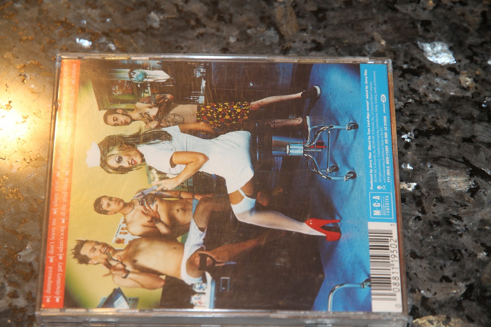
This theme is carried onto the back of the cover, while this shot includes the band acting for the camera. The female actor used in this picture looks like the stereotypical woman who would admire and fancy this band.

The disc has the logo of blink 182 at the time, in a light blue and white colour, which is associated with boys. The leaflet as you can see below is included which has the bands lyrics of their songs while on the back is various photographs of the band and possible friends posing in a line.

Very creative and amusing.

Underneath the disc appears to be someone's eye, someone staring straight back at the consumer. The yellow theme is carried on here as well.


I like this green day digipak as it reminds me of some very old school photographs, i like the lay out of this cover and back, photo's in sections. The black and white theme is complimented by the bright yellow dots covering the peoples faces adding a feel of uncertainty and disguise.
The black, white and yellow theme is carried on throughout the case. The disc and leaflet both have writing scribbled down, producing a unfinished/ruff editing feel.

Underneath the cd they have chosen to place a photo of the band members hugging and looking up at the camera in very bold clothing. Their facial expression provides us with a don't care attitude.

This razor light front cover looks like a sort of scrap book, with random objects thrown together. The colour red in present throughout this digipak, without it, it would be very plain and probably would not attract the audiences attention.

I like the dotted effect on the back and which is also present on the cd and leaflet.

The inside has no eye catching colour only a 'individual' design consisting of dots.

Underneath the cd is a picture of a man asleep/passed out in a van. The picture is not very clear.


This rise against digipak reminds me of war posters, stamps and tea bags. I like the old school style and silhouettes designs. There is only 2 main colours of the cover, light yellow and black.
The cd carries on the same kind of design, with big R and A letters which reseamble the band name Rise Against. I love this piece of art work, it would of taken a long time to make.

On the back there is a silhouette of the band and their lyrics in a font which looks like the old typewriters could produce.


This is another blink 182 digipak. The colour scheme is mostly black but with green, red and yellow which could be associated with the Jamaican flag. I like the way the cd's have very simple designs yet they resemble parts of their lives.
Subscribe to:
Posts (Atom)